Logo | Chung Dha
  • Portfolio
  • News / Reviews
    • First Look
    • Camera Reviews
    • Gimbal News / Reviews
    • Packaging review
  • Tutorials
    • Adobe Premiere Pro
      • Motion Graphics Template
    • DaVinci Resolve
    • Final Cut Pro X
    • DIY
    • Videography
    • Photography
    • Youtube
  • Contact
  • Cookie Policy
  1. Home
  2. \
  3. Logo

Logo

Date Title Views Likes Comments
  • Date
  • Title
  • Views
  • Likes
  • Comments

Lighthouse / Availale

Chung Dha Lam January 30, 2009

Lighthouse digital logo of an abstract shaped lighthouse using facet styling, however it looks very much like an 3d low polygonal model of and lighthouse. This logo could be used for any 3d design company or games design company. Anything that got to do with 3d designs. This logo is currently available for sale and […]

King’s Poker Card Casino – Thun / Schweiz

Chung Dha Lam January 19, 2008

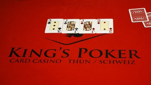
This is my second win at Design Contest.net. King’s Poker is a casino in Switzerland. The illustration is an ace poker card the best card with a crown on top for the king.This is the entry of the logo in the first version. With a bright orange for that is bright for a close to […]

Circle of Artists.com

Chung Dha Lam January 4, 2008

This is my winning entry for the Circle of Artists.com contest. Also my first win in a logo contest. CircleOfArtists.com will be a site for painters & photographers.This is the first version I send in which was too bright.This is the 2nd revision with darker colors and more earth toned.This is the 3rd revision with […]

Booteek.org v3.1 / Available

Chung Dha Lam August 1, 2007

Revision of the 3rd design. I revised it after the comment of the contest holder. I made a more detailed yarn and made the name bigger. Also tried more color combinations. I also made it underline the name better

Nabemono

Chung Dha Lam December 20, 2007

This is one of the assignments for TMVG2 where we simulate working in a real design company. This module we all got allot of assignments to make and also special deadlines. This assignment I had to make a logo for Nabemono a Japanese restaurant that is based in London and want to open a new […]

Canewriter / Available

Chung Dha Lam December 6, 2008

A logo which can be used for food reviews or candy reviews or any reviews or blogs at all. The logo stands for fun, sweet and great. The illustration is a Candy Cane with fountain pen on the end. The logo actually works better without adding gradients to it. If you like this logo and […]

Protecs

Chung Dha Lam August 16, 2010

Protecs logo is based on a shell of a sea creature called the Nautilus which is a kind of octopus with a shell. Protecs is a house renovation company and they wanted an abstract logo, so I made this cause a shell is a house of a see creature and protecs which is a short […]

Stints / Available

Chung Dha Lam November 2, 2008

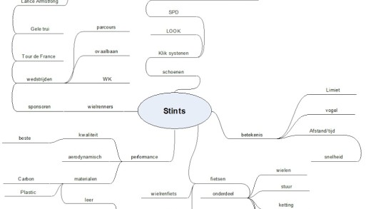
Here is an almost full logo design process only part missing is a costumer that reviews it, because this logo is made for a school project. I had to design a total new company out of nothings, this include choosing the name to the products. Here I will show you a bit of the design […]

Logo contest entries

Chung Dha Lam December 28, 2013

Haven’t lost my touch yet in Graphic design, so gotten few email about some contest and see if there were few interesting ones I feel that I could probably win with a great looking logo. Well here is one for Athletes in Motion. While others were making fairly standard soccer logo’s I use my standard […]

False Truth / Available

Chung Dha Lam September 15, 2008

This is just a logo that shot into my head today I actually wrote two words on top of each other and I spotted the f and the t are an reflection on top of each other. One of the word is indeed “false” but the other word was actually “true”, however true was a […]

Re-redesign Wacom

Chung Dha Lam December 22, 2007

As most designers who follows the brand changes the most recent change to Wacom logo was not that appreciated by most designers. The web 2.0 illustration of a abstract things designed by Wolf Olins was by far from anything that got to do with Wacom tablet or design. For more information click here to read […]

Booteek.org v2 / Available

Chung Dha Lam July 30, 2007

I went looking about the crochet thing and put my hand together and though about my hands with fingers going criss cross. I just try to make one hand with one line and this came up. Afterward I saw looks allot like a bird spreading his wings. Made multiple version cause you can gradient this […]

Second submission to Ella Koon Logo

Chung Dha Lam March 26, 2009

I had asked Ella Koon if people could submit more then just one logo entry and you can send more then just one. So I made a second design however the first design seem to be pretty powerful and might be hard to top even by me making a second or third design. Even this […]

Available / Advisory Now!

Chung Dha Lam March 5, 2008

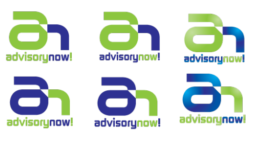
Here are the entries for the AdvisoryNow! contest. Here I made the log with an integration of the letters A and N, making it into a almost single shape. Here I tried to show the ! sign more and tried various positioning to search the best result.Here this is a different form of integrating the […]

ShiiZen / Available

Chung Dha Lam November 4, 2007

This in my logo entry for Shiizen. This a acupuncture company in Australia. The name Shiizen means nature in Japanese. However I know it should be shizen with one i instead of two. But the company is called Shiizen with double i. Here I tried to make hills with nature and bottom with a body […]

Next Shutter Photography Logo / available

Chung Dha Lam April 16, 2015

This logo is for a Photographer or Photography magazine or could even be for an videography company with an initial of N&S. The logo represent the initial N & S is an abstract way, as the inner square is the most minimalistic way to represent both the initials in the same form as the shape is […]

the Pepper Arts / Available

Chung Dha Lam January 19, 2009

This logo is a P build up from different shapes, sizes and colored peppers like and mosaic. This logo could be use for an artist or an mosaic are group. Also could be uses for company that plants or grows peppers. This logo is currently available for sale, so if you are interested you can […]

Faith Based Leadership / Available

Chung Dha Lam January 17, 2008

This is my entry for Faith Based Leadership. With hands that are used for different religions and culture for giving and receiving, and the hands are also dove for happiness. So the meaning of them is giving and receiving happiness.This is a revision with the hand more shaped like a dove with the thumb having […]

Mapelli Abrasivos

Chung Dha Lam September 22, 2007

I made this logo for a friend of mine in Brazil Luiz_H. His father got a company who needed a facelift from there old logo. There old logo was very good but needed a facelift and more modern. The picture below was there old logo.Here are few version of the new logo. I change it […]

M2 Dragon / Available

Chung Dha Lam March 2, 2013

Another imaginary logo with a dragon shaping an M2 and so the M2 Dragon came to existence. It was for me an interesting way to try out drawing an designing something that has a major asian  feel to it and a dragon came in to mind. As a dragon has a snake like movement it […]

King’s Poker logo in action

Chung Dha Lam September 6, 2008

I recently found my own designed logo in action displayed on the King’s Poker website. It’s very great to see some of them in action and know that it is used well. I am very proud of this design, because it suits this card casino very well.Click here it view the original design and the […]

Booteek.org

Chung Dha Lam July 29, 2007

My first entry on the Design Contest forum. Its a logo for a charity company named Booteek.org. Booteek.org is a social enterprise from Sri Lanka. We sell products created by Chitra Lane Sheltered Workshop in Sri Lanka. Chitra Lane is a Colombo based non-profit organisation, running a school for special needs children and a workshop […]

Ella Koon Queen Mean Bee

Chung Dha Lam March 25, 2009

Ella Koon who is a Chinese singer, actress and model had placed on her blog on AliveNotDead.com a contest for designing her a logo and she also has a nickname called QMB, which means Queen Mean Bee. However I don’t think she is that mean but mostly funny, with allot of joking about and work […]

Photography by Nik / Available

Chung Dha Lam February 21, 2008

This is my entry for Photography by Nik. I made a the letter Nik by myself and added a realistic looking lens behind it. Because it looks odd when changing it into flat or black white I made those versions more simple. And also still keep the same kind of look between them.

Advertisements

Recent Posts

  • Call sheet template 2026
  • Student Film Cliche Bingo Card
  • Communication Sheet
  • Unboxing Neewer MS-300C Carbon Microphone boom pole
  • Why You Should Buy Vintage Lenses in 2026
Chung Dha © 2024 Tsuen Wan, Hong Kong
  • Close
  • Portfolio
  • News / Reviews
    • First Look
    • Camera Reviews
    • Gimbal News / Reviews
    • Packaging review
  • Tutorials
    • Adobe Premiere Pro
      • Motion Graphics Template
    • DaVinci Resolve
    • Final Cut Pro X
    • DIY
    • Videography
    • Photography
    • Youtube
  • Contact
  • Cookie Policy