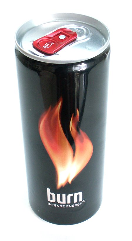
 I also bought this can at Belgium. Burn an energy drink by Coca Cola company. I’ve actually spotted this in one of the supermarkets there.
It’s actually the most cleanest can design I’ve ever seen. The sleek can have very little graphics and is overall just black with the flame logo. And on the backside the information. And also part of the information is shaped like the flame logo. But this sleek can is actually smaller than the Coca Cola light plus can and only fits 0,25L in it.
The taste of it is actually the same as Red Bull but with less after taste. Actually it taste better and you won’t get a breath that taste like it.
However the warning on it seems very serious about the strength of this power drink. But it got allot of serious competitors with this drink actually , like Red Bull, Golden Power, Bullit and more. However it is one of the best looking can design out there on the shelf.
